Design must be long-lasting progressive
Less && More
Broken pıxel, broken heart
Inspect element
KOD Ideas are made in-between FORM



Design must be long-lasting progressive
Less && More
Broken pıxel, broken heart
Inspect element
KOD Ideas are made in-between FORM

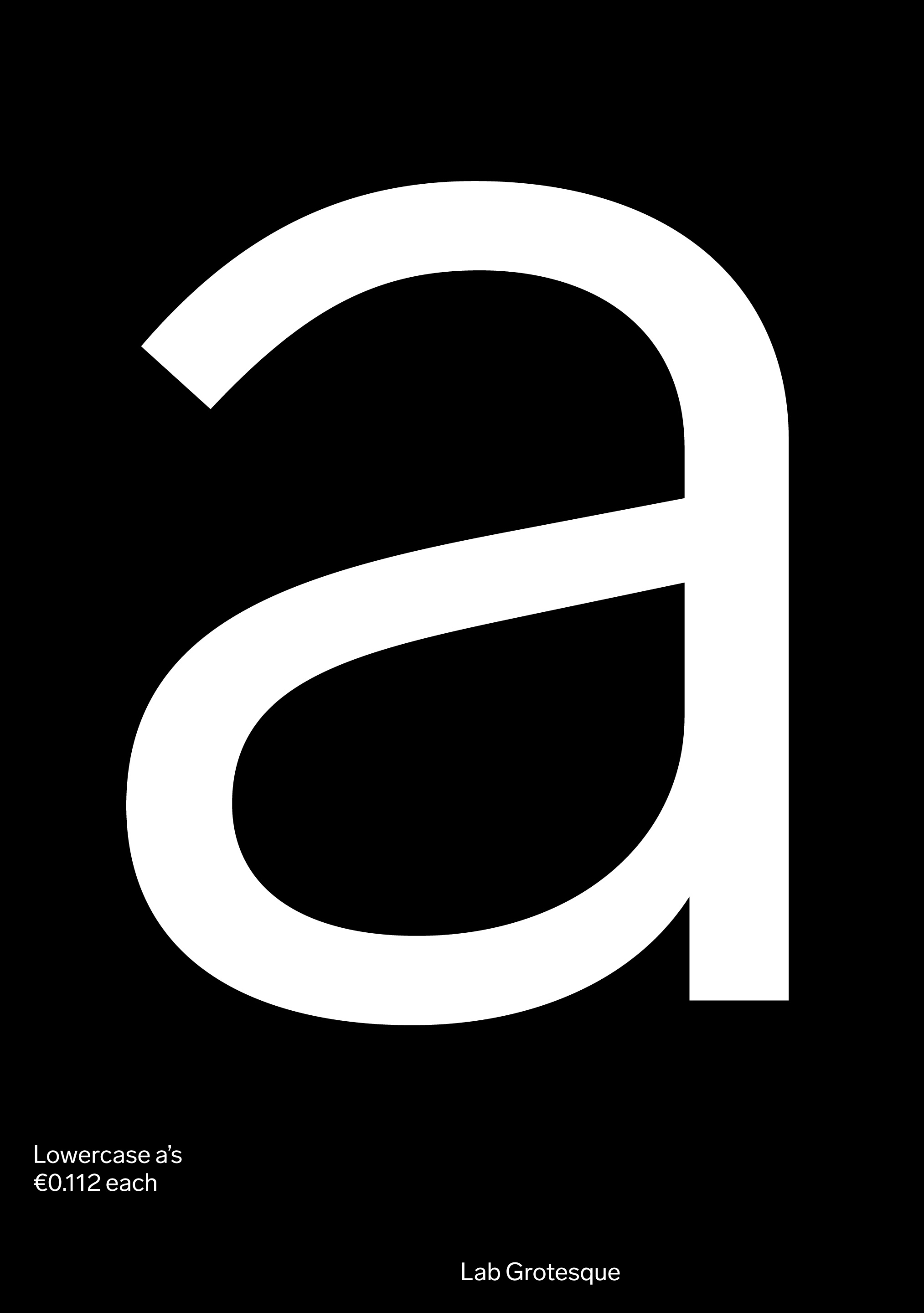
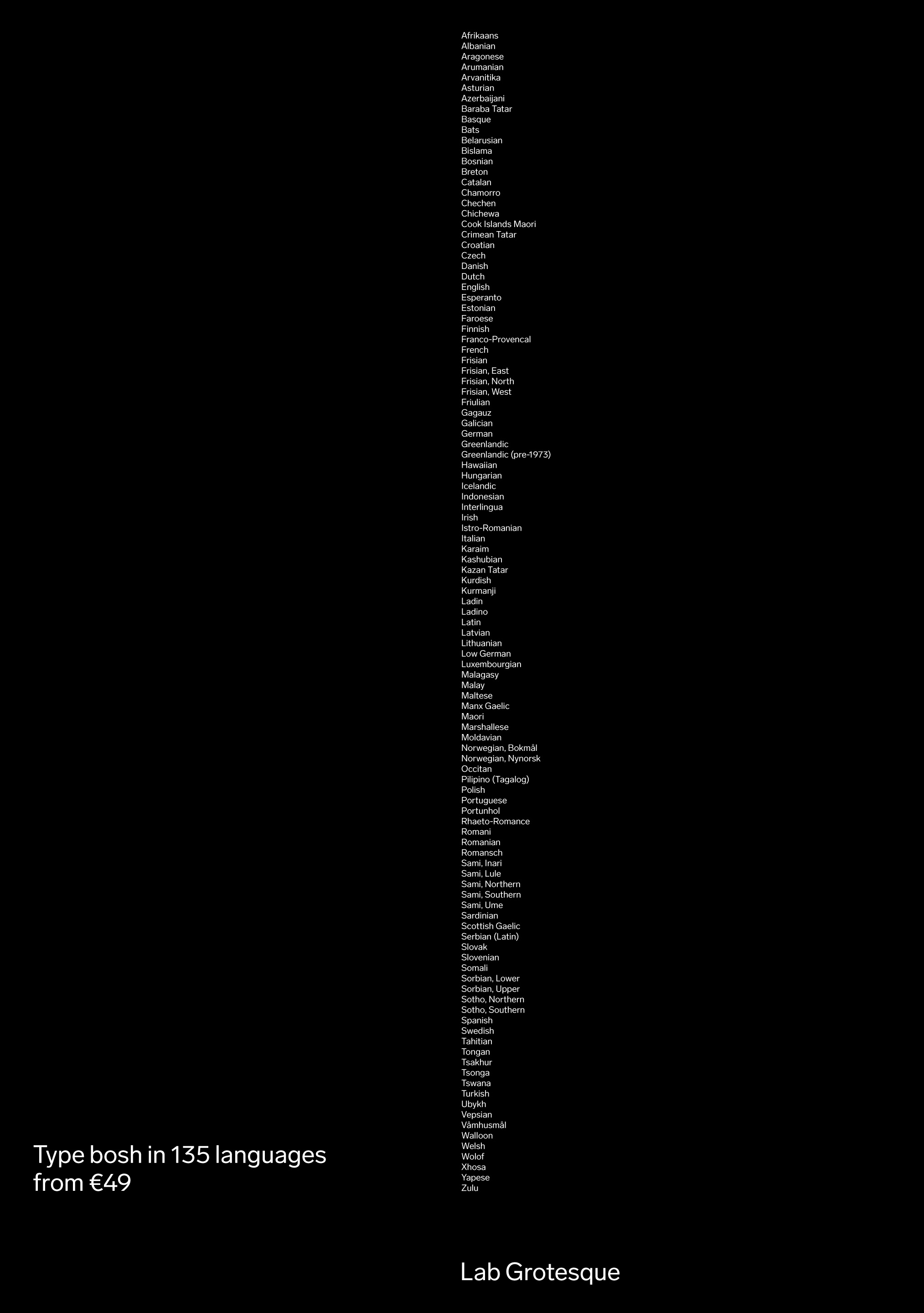
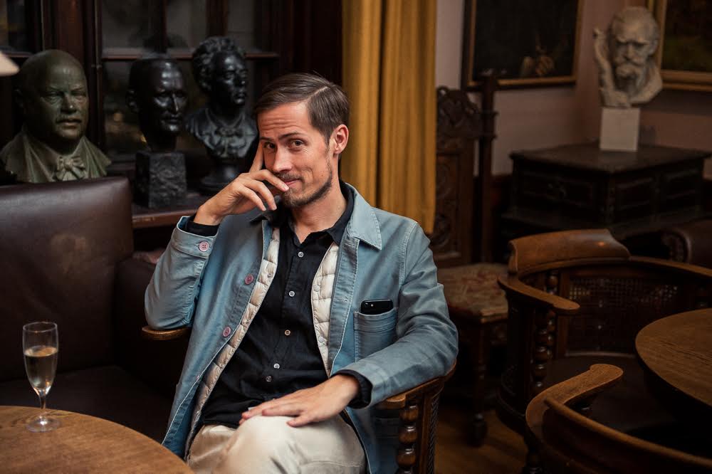

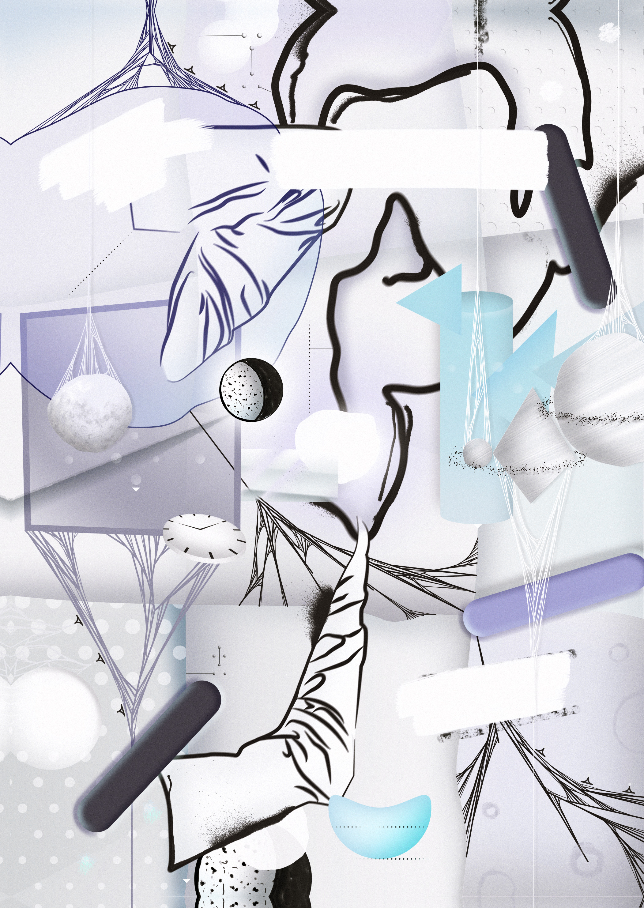

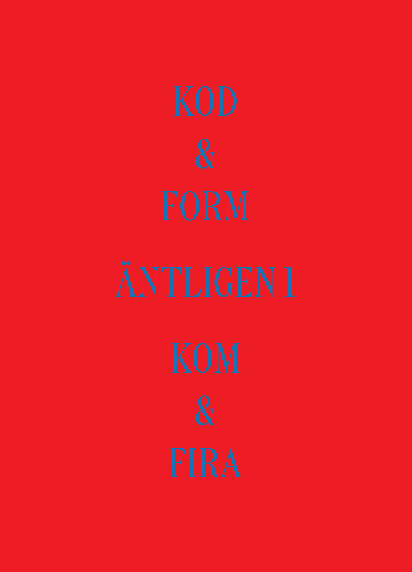
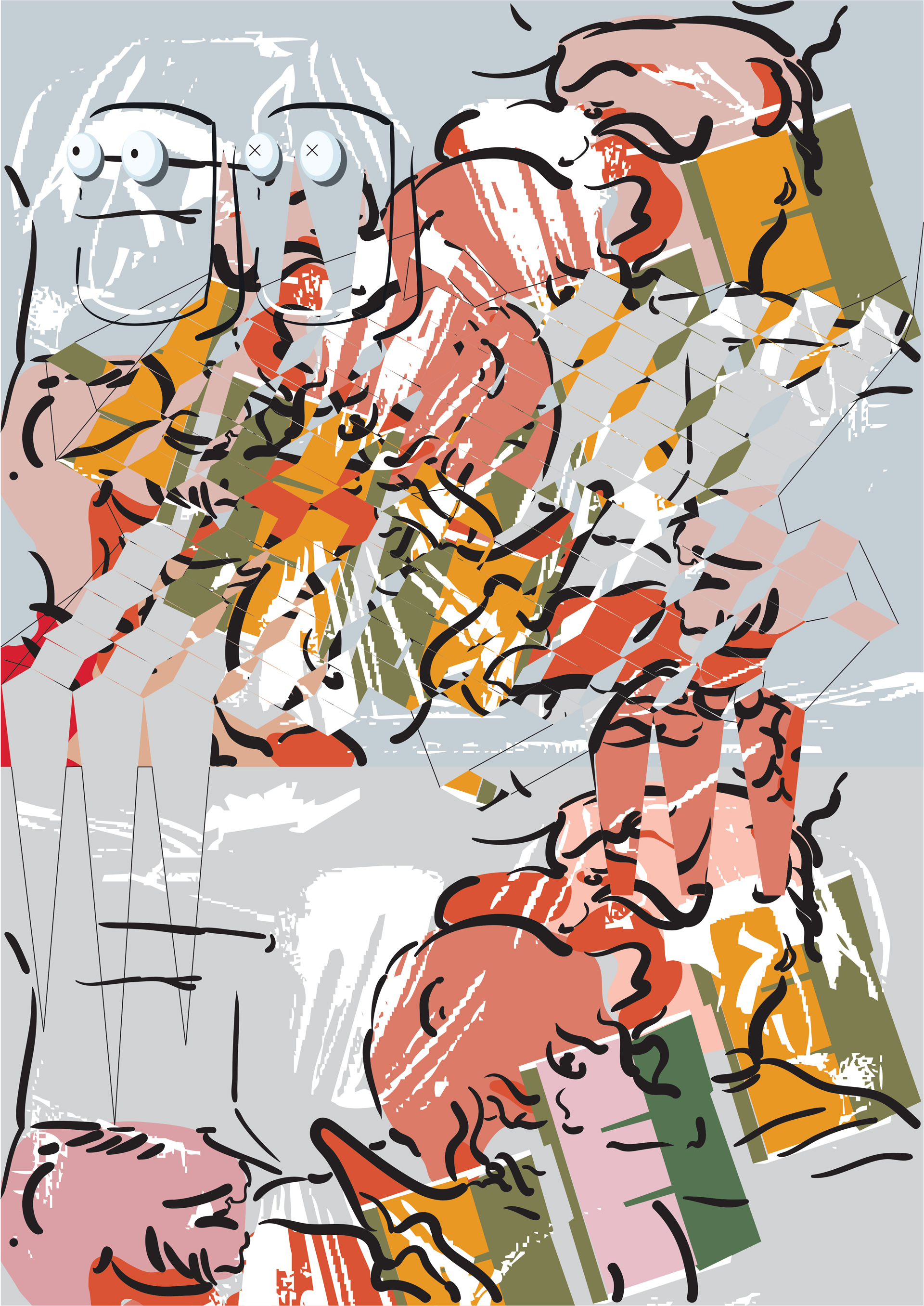
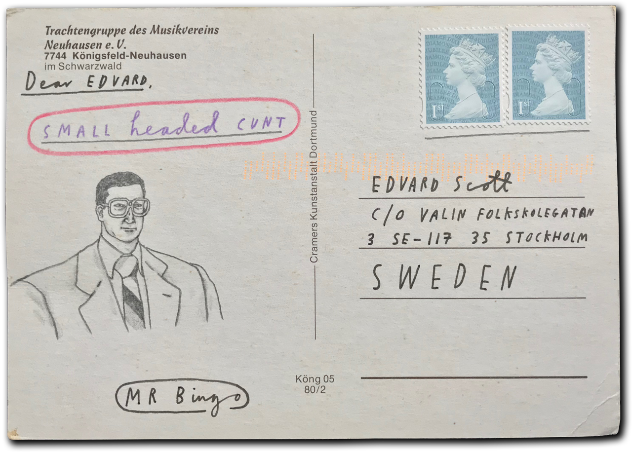
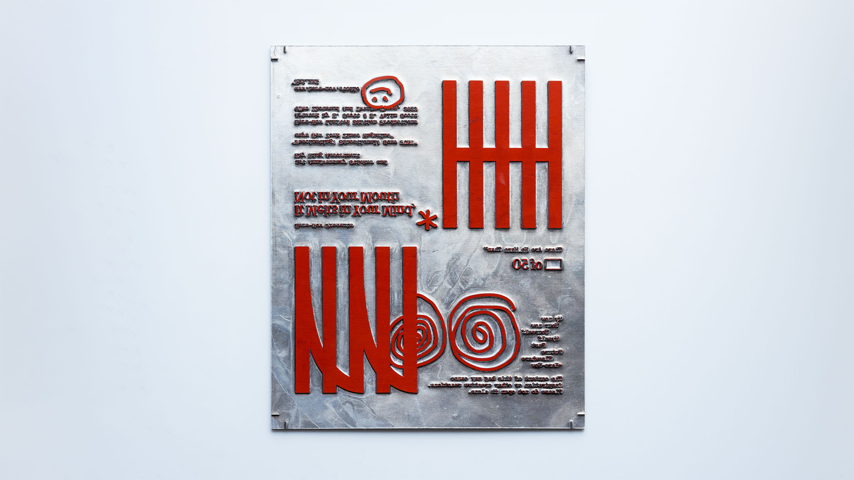
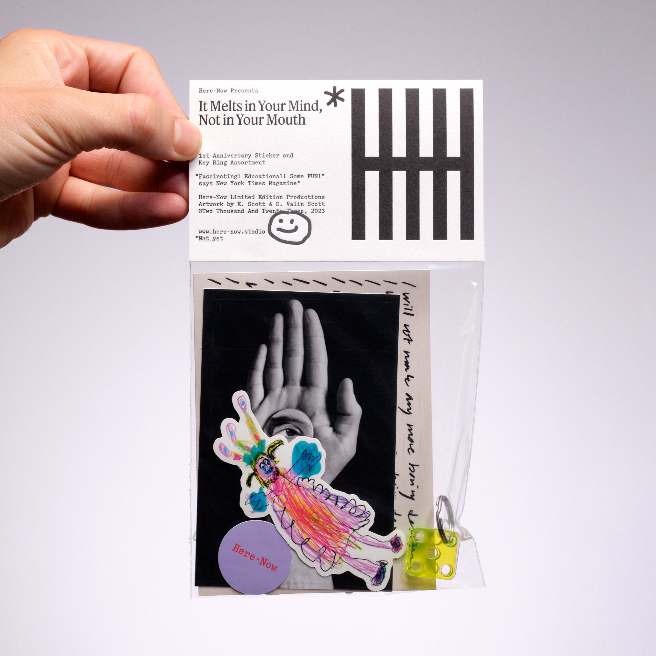
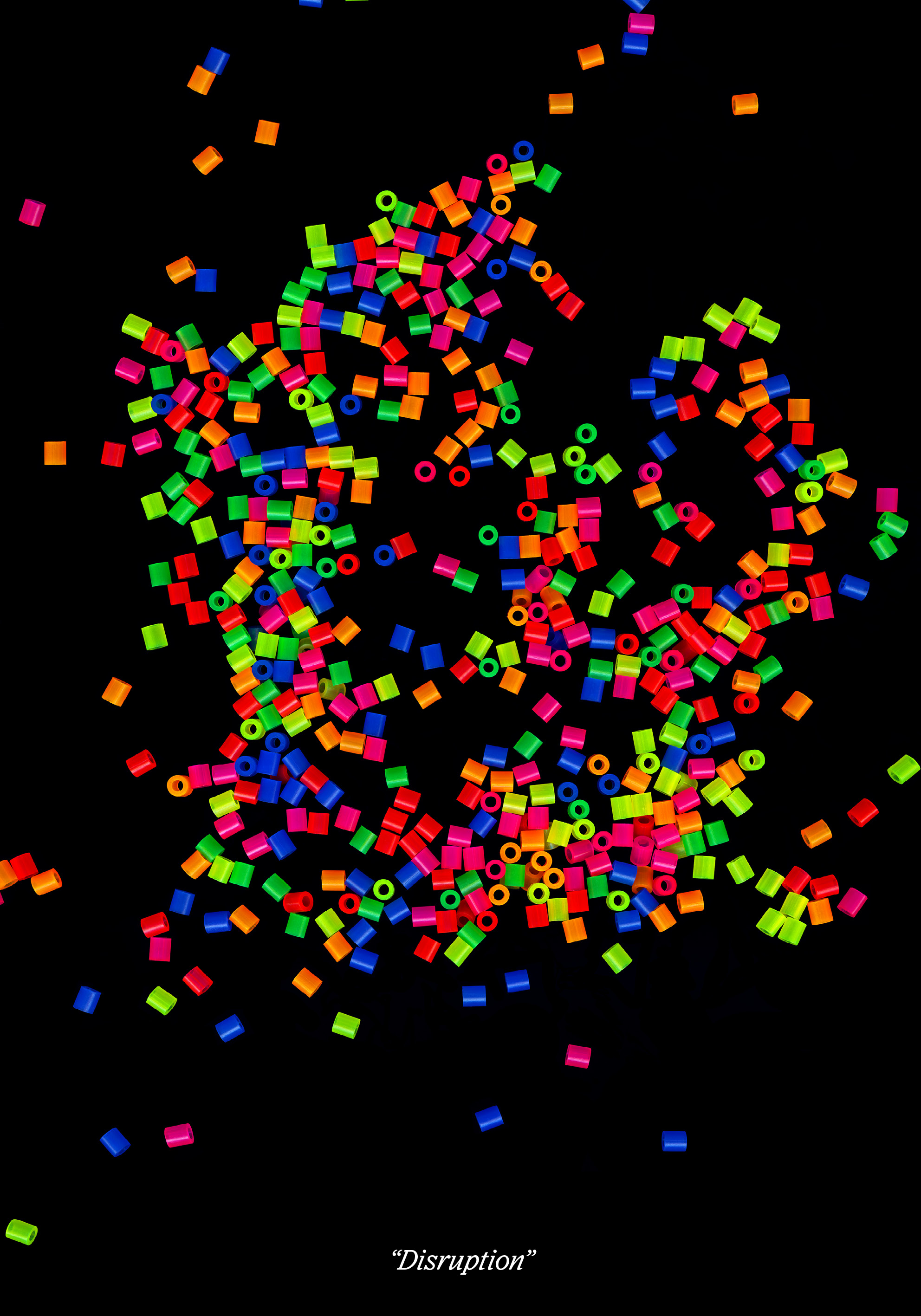
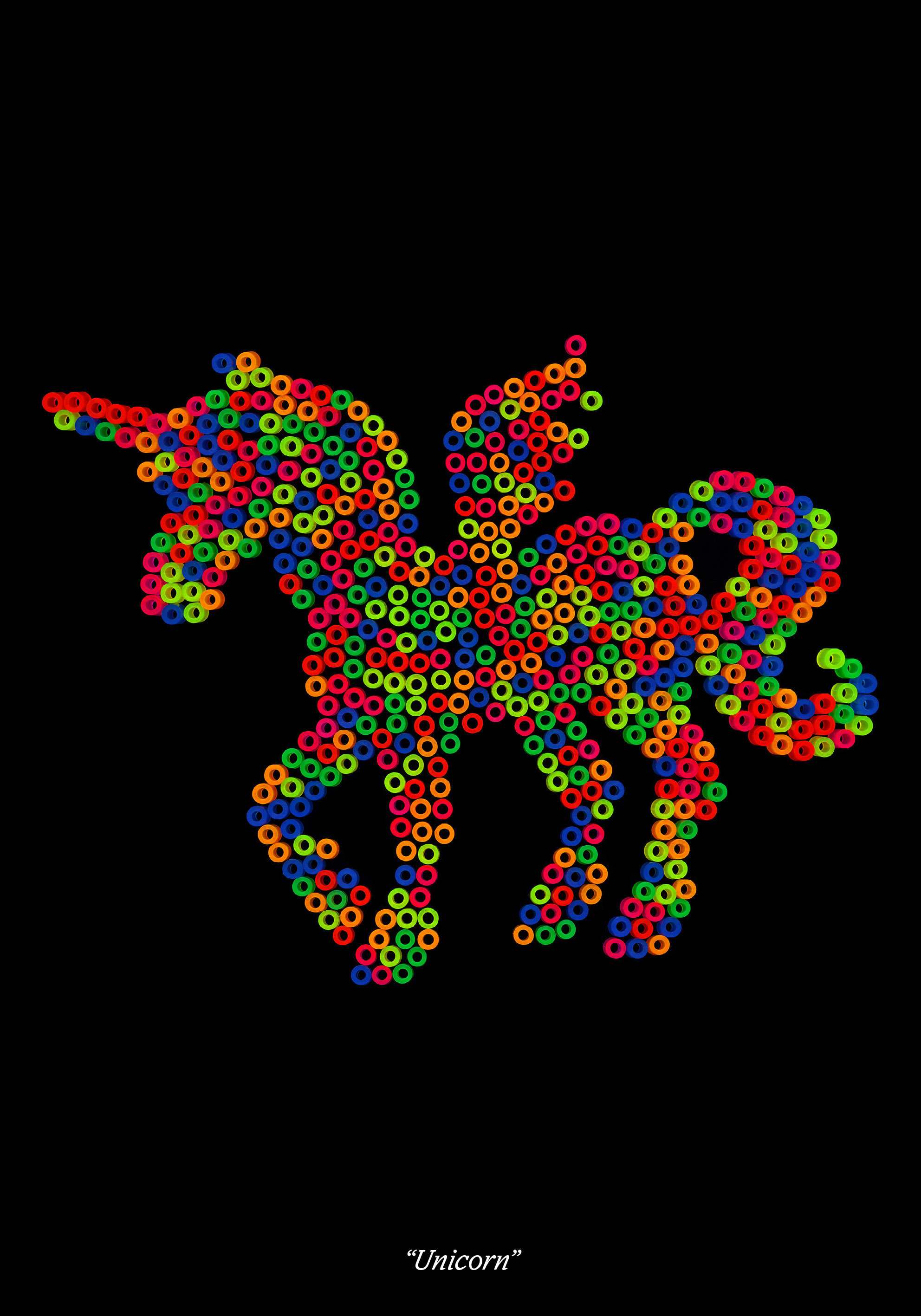
On 17 October 2023, Edvard Scott and Here-Now cordially invited distinguished guests to a one-night-only exhibition to celebrate the 1st anniversary of Here-Now. On display were 27 posters showcasing the studio’s diverse and distinct output. Also: drinks, music, and popcorn. The hyper-exclusive It Melts In Your Mind, Not In Your Mouth 1st-anniversary sticker and key ring assortment was on sale. Only 50 unique copies were produced, and all proceeds were donated to reforestation projects around the globe.
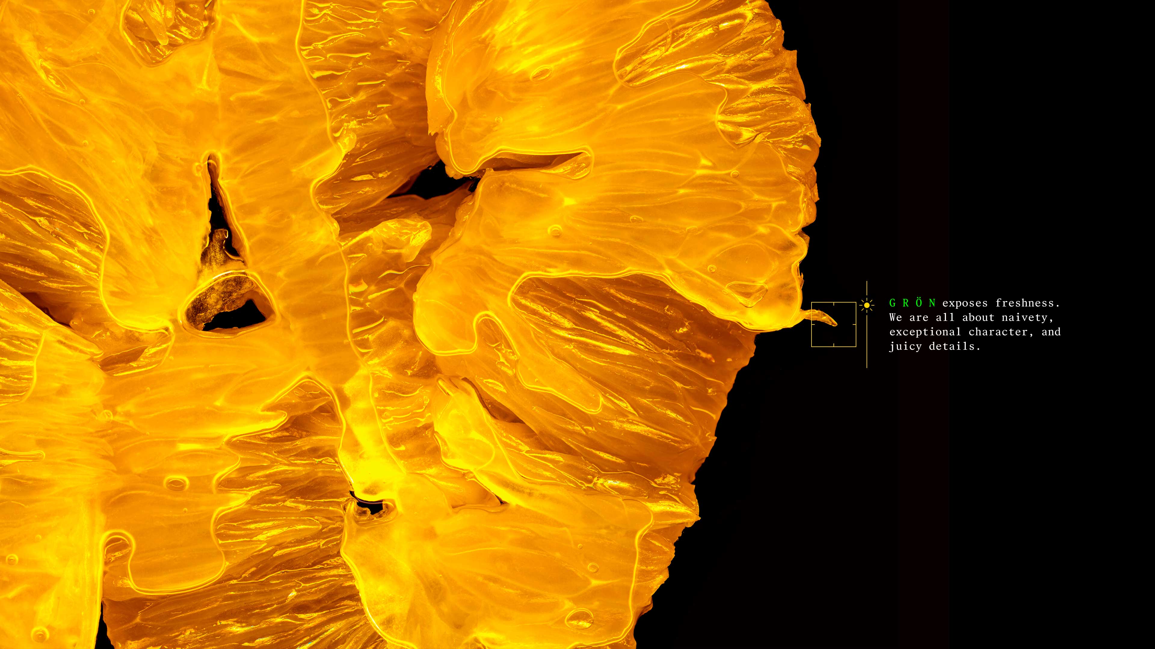
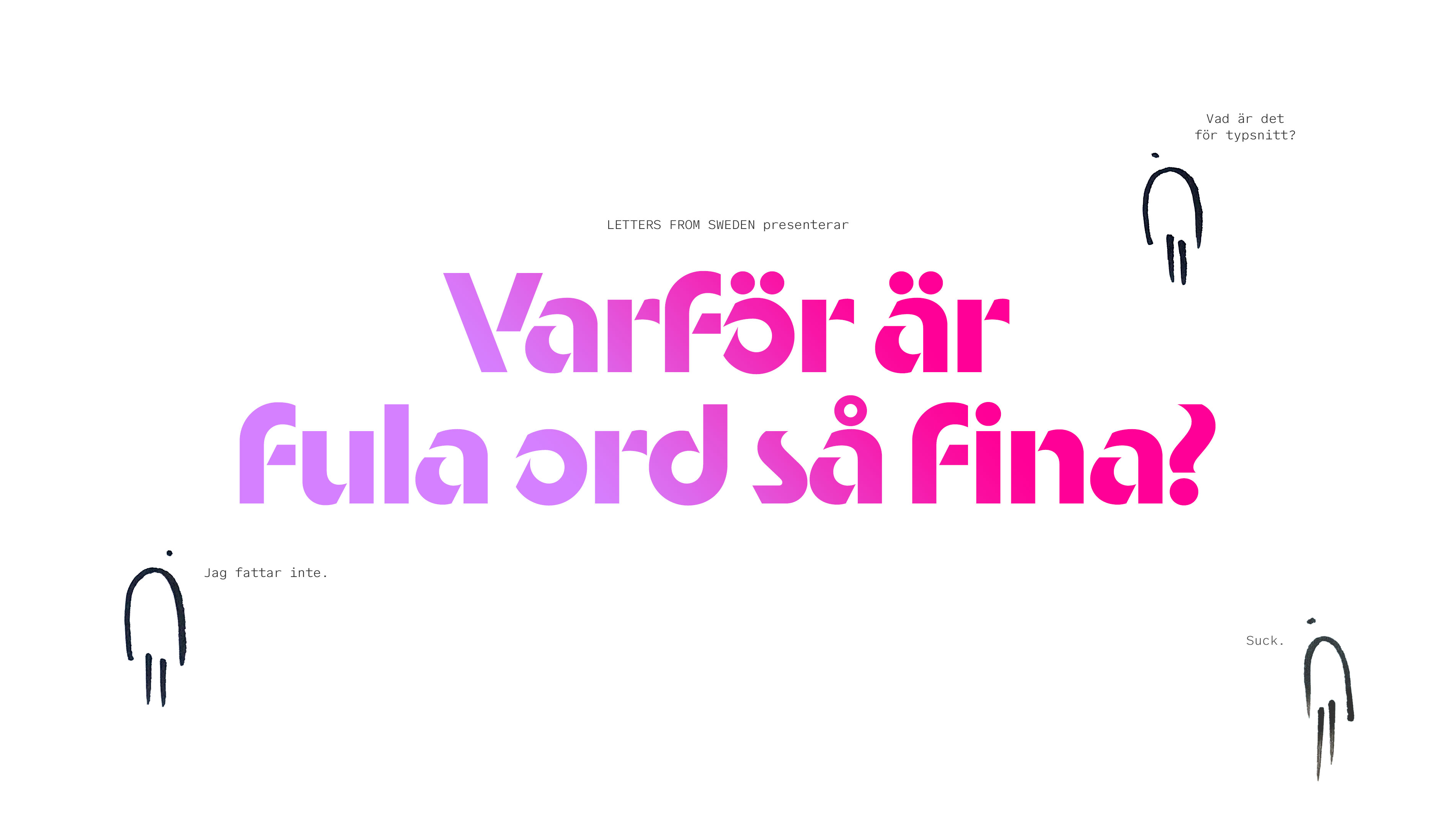
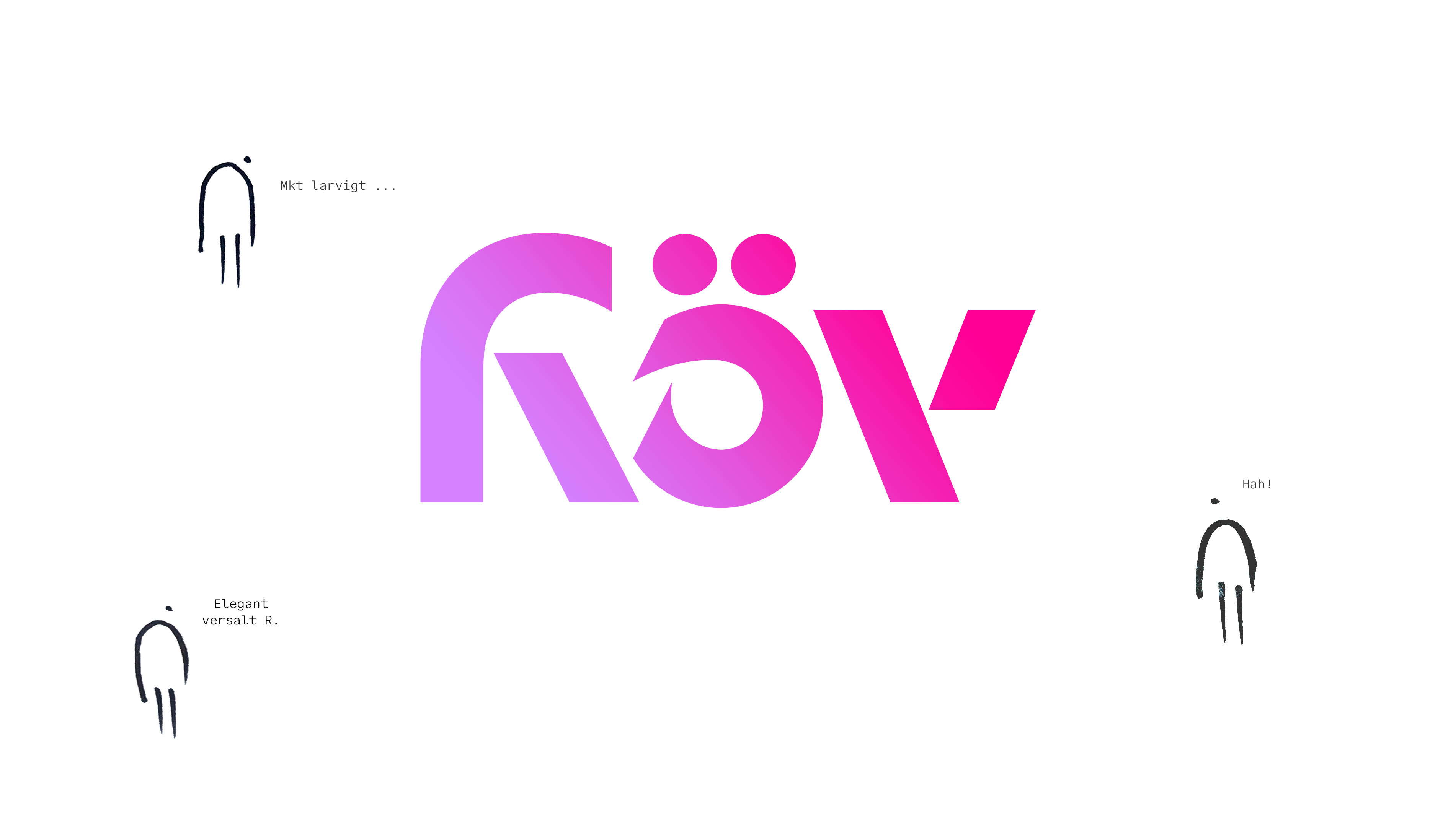
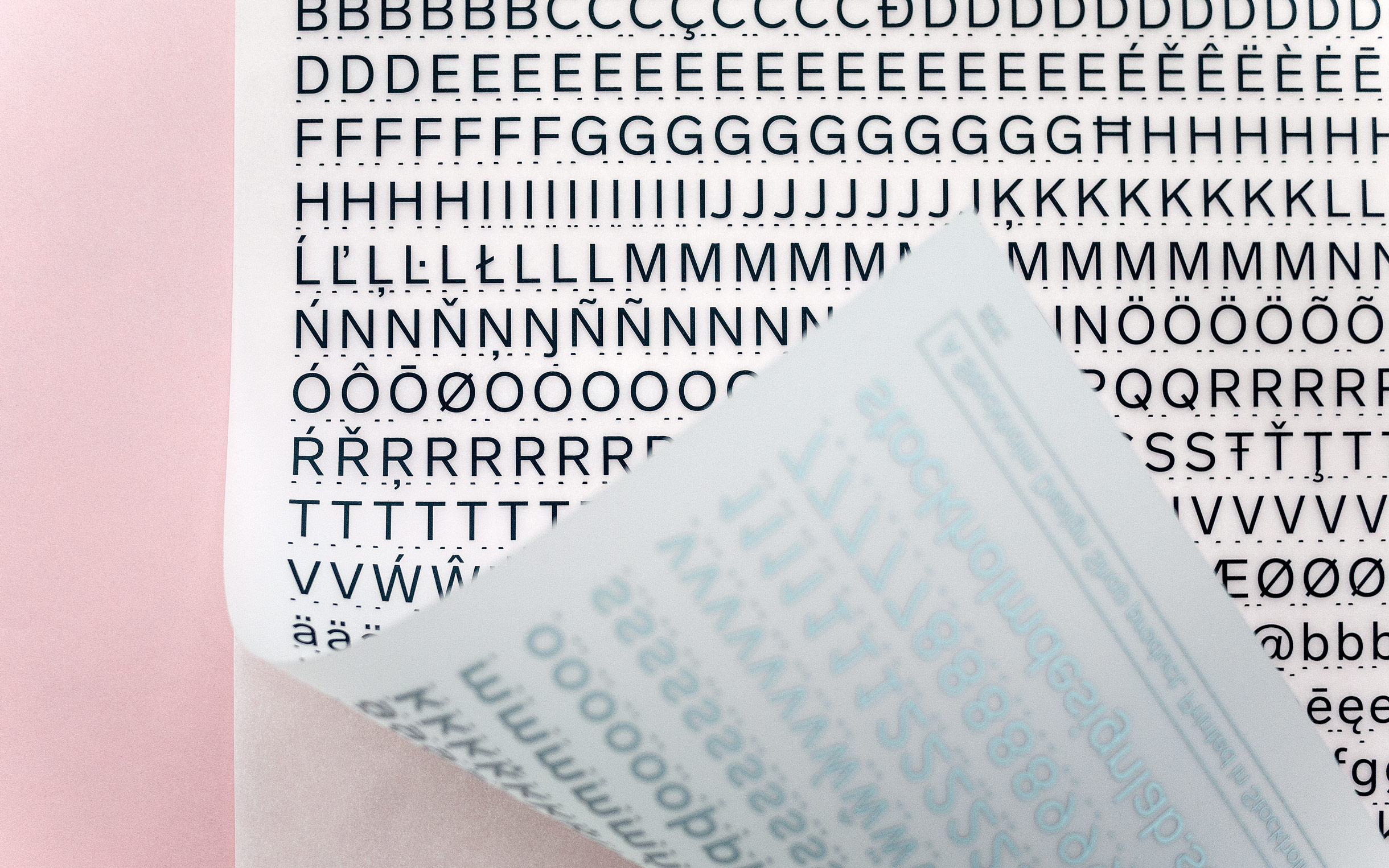
G R Ö N hopes to become a green space for typographic creativity. A co-habited place where freshness, fun, exceptional character, and juicy details are highly valued and looked after. G R Ö N is initiated by Letters from Sweden and Edvard Scott, but belongs to its members. We share its profits; both the learnings and the cash. Join our world.
Creative direction
Concept development
Visual identity
Art direction
Photography
Copywriting
Website design


G R Ö N dancing is like an overexcited ballroom dancer, this breakaway typeface swings, spins and skids into the hearts of most keen audiences. Try Viktor’s first font, gron.world/dancing/


G R Ö N need4speed is like nitro in your Font Book. An untameable typographic beast ready to be released onto green pastures. This magnificent madness is Tuva’s first release, gron.world/need4speed/


You call it G R Ö N tobo. We call it love. Evocative, emotional, expressive. Whatever case (UPPER or lower) you’re from, this is for you! Try Reidar's first font now,gron.world/tobo/


G R Ö N zoid is a collection of independent movements. An anarchistic approach to angles. Its lack of hierarchy makes everyone feel welcome. Zhuzh your designs with Zoid, gron.world/zoid/
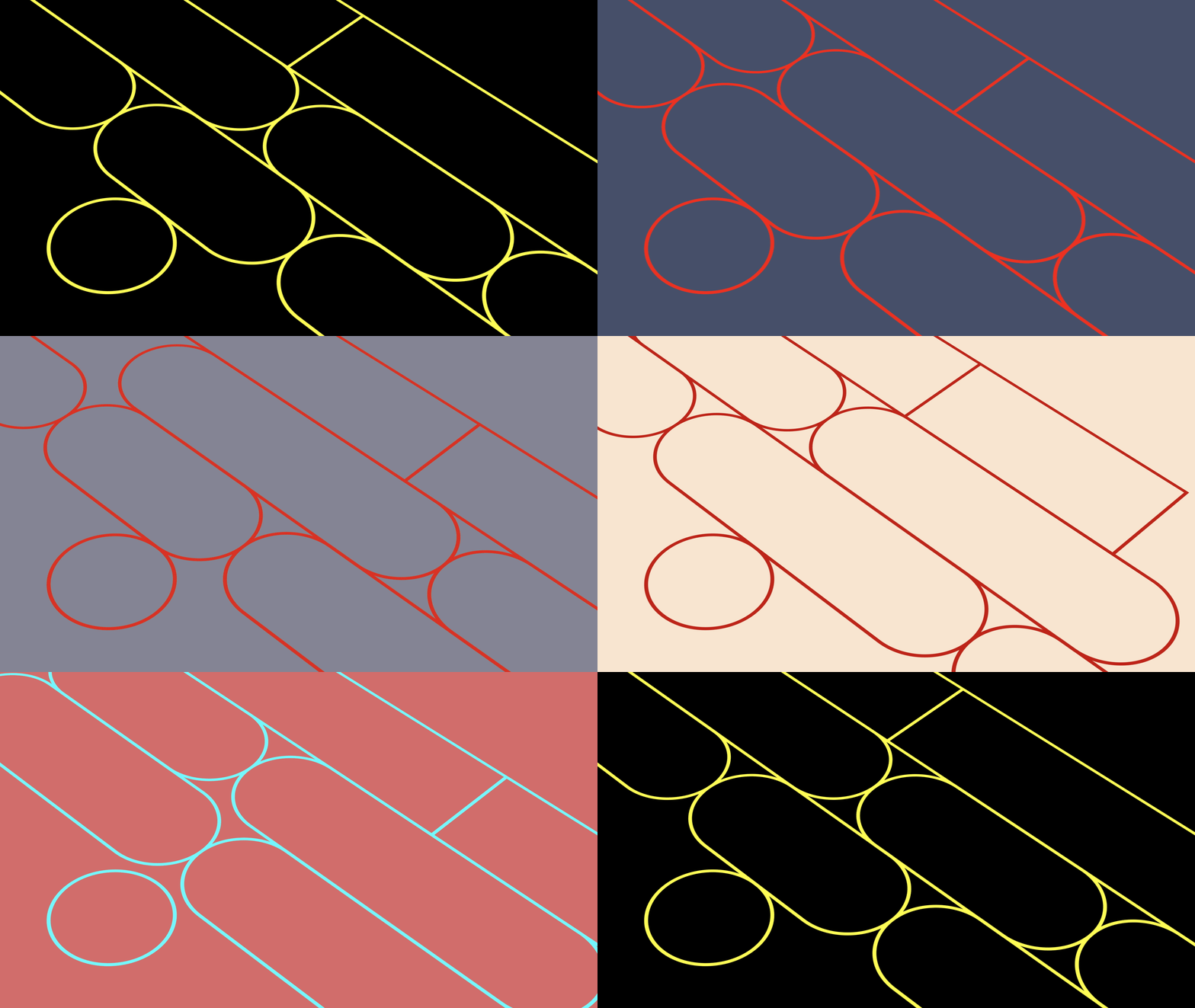
New website for the undeniable Studio Kleiner. Designed together with the masterminds themselves. Code by Bobby Digital.
🪩NEW WORK for STUDIO KLEINER
— Edvard Scott (@kodform) February 20, 2023
It's always a pleasure to collaborate with the sweetheart masterminds themselves. 2446 images and videos now at https://t.co/v6Niwjcabq. Code by Bobby Digital, design by yours truly. pic.twitter.com/C9mBPpk4mV
ANNOUNCEMENT
— Edvard Scott (@kodform) October 17, 2022
I'm starting a design studio with great ambitions. Because I think we need great design. Watch this space over the coming weeks, or follow Here-Now (https://t.co/wpZgXokE8G) to learn more. pic.twitter.com/nYO4P8p2sm




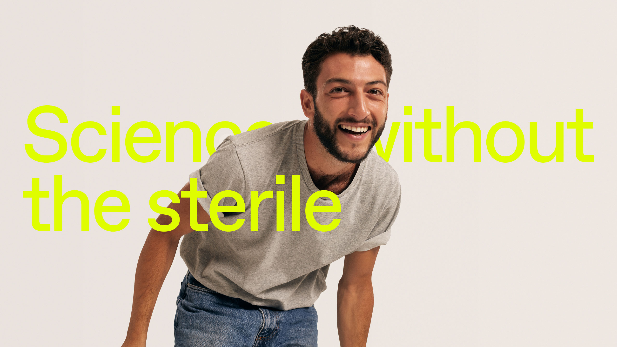
Mojo are fertility geeks, in particular male fertility and sperm. So geeky that they built an AI-powered microscope that revolutionises both accessibility to and the level of standard in sperm analysis.
All work done as part of a stellar team at EY Doberman.
Creative direction
Concept development
Brand
Art direction
Photography
Digital product
Website design


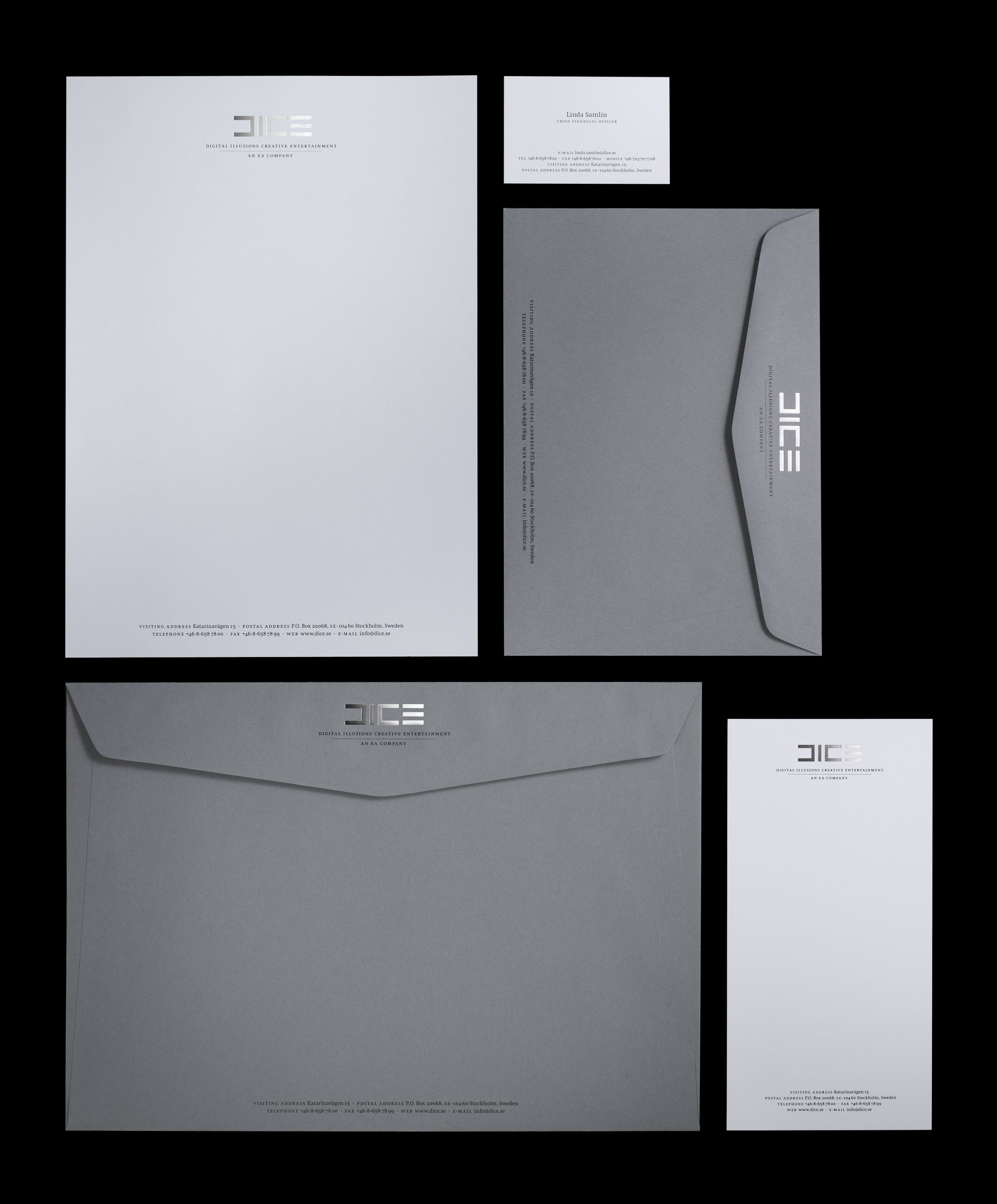
DICE creates blockbuster games. For the past 30 years, they’ve created award-winning experiences like Battlefield and Star Wars Battlefront, and every day millions of players across the globe play their games.
In 2007, I was part of a stellar team at Stockholm Design Lab that designed the brand – that‘s still around today.
Visual identity
Brand guidelines
Tone of voice
Typography


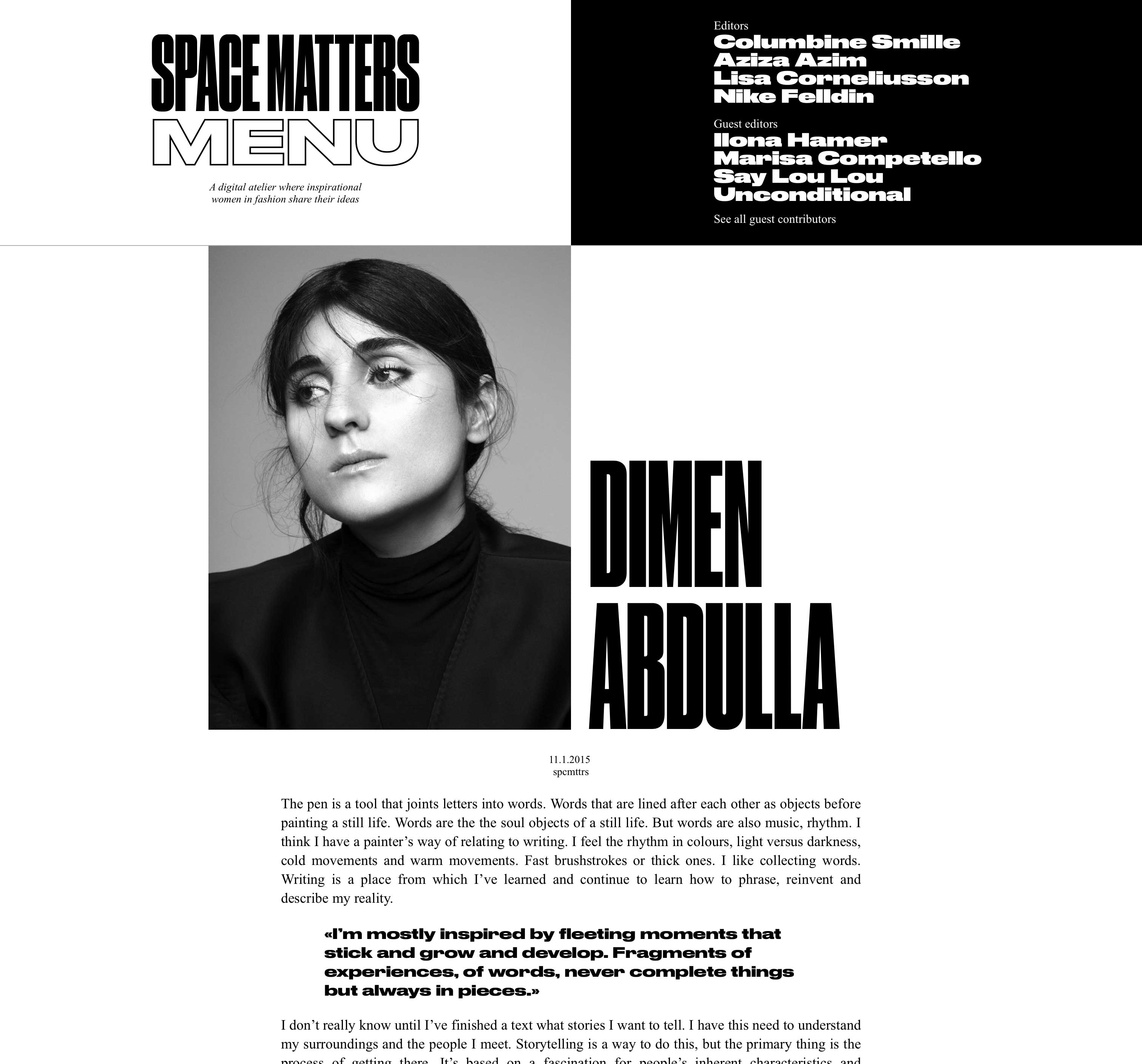
Space Matters captures what’s in the air: the thoughts, the styles, the personalities. Welcome to a digital atelier where inspirational women in fashion share their processes. Created with Lisa, Nike and Columbine, designed with Christopher West.
Concept
Design
Typography
Development


After ten years on the Nordic art scene, Market wanted to take a major leap forward. With a new venue and new courage, the fair, in 2016, moved from a newcomer to an established brand on the art scene. The new brand identity has a bold approach and refers to both the artistic and the commercial. Drawing inspiration from the world of FMCG with classic brands such as 7-Eleven, Dunkin‘ Donuts, Tesco, and in particular, the giant ESSO. It signals marketplace and commerce. But also gives an obvious nod to pop art and ready-made. Together they form the foundation and spirit of Market.
Designed at Stockholm Design Lab.
Visual identity
Brand guidelines
Tone of voice
Typography
Photography
Signage


